From product-led PDPs to look-led selling systems
Buying Moment
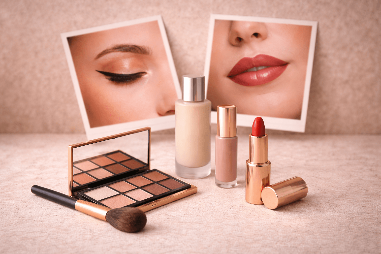
Inspiration / transformation / look replication
Structural Unlock
Ability to create and test multiple look-based storefronts across trends, creators, and occasions
Outcome
Looks became structured, repeatable selling environments instead of static content
The structural mismatch
Creator content, tutorials, and trends drove demand. People arrived wanting to recreate a look. But the storefront sold individual products. Traffic landed on product grids, category pages, and individual PDPs.
Looks were explained in content and social, but the site asked shoppers to assemble them themselves.
The brand was inspiring looks everywhere, except where buying happened.
Changing the unit of selling
The team did not treat this as a PDP problem or a content gap. PDPs were not redesigned, and no additional campaign pages were introduced. The catalog remained exactly the same. What changed was the selling logic.
Makeup looks became storefronts, while products moved inside each look. The experience began with inspiration and unfolded into a structured path to recreate it.
This was not a visual change but a structural one: a shift in how decisions were organized rather than how products were displayed.
The catalog stayed the same.Collections stayed the same.The selling logic changed.
Looks became operational
The brand introduced look storefronts structured around inspiration moments:
- creator looks
- trend looks
- occasion looks (bridal, party, everyday)
Each look storefront opened with the visual inspiration, grouped all products needed for the look, highlighted key steps, and concluded with a focused CTA. Campaigns and tutorials began landing directly into looks instead of product grids.
Execution became repeatable:
- identify the look
- duplicate a base look structure
- update products and visuals
- launch
What previously required manual curation became duplication and iteration. Looks shifted from inspirational content to a scalable merchandising layer.
What changed
- Multi-product add-to-cart increased across look-led traffic
- Creator and tutorial campaigns landed into complete buying paths
- Merchandising shifted from bundling products → look orchestration
- New looks could be launched without restructuring collections
Buying shifted from choosing products to recreating a look.
The real breakthrough
The breakthrough wasn't more tutorials or better product grids. It was the ability to generate multiple look storefronts dynamically based on how customers entered and what inspired them: creators, trends, or occasions.
Looks stopped being inspiration.They became a system the brand could create, adapt, and scale.
Key Takeaways
Looks became the primary selling unit, not individual products
Campaigns could land into complete look environments
Merchandising shifted from manual bundling to look orchestration
New looks could be launched without restructuring the site
Selling evolved from product selection to transformation-led buying