From product catalogs to benefit-led discovery systems
Buying Moment
Explore / discover / solve a need
Structural Unlock
Ability to create and test multiple discovery storefronts based on benefits, moods, and occasions
Outcome
Discovery became structured, repeatable, and scalable instead of left to browsing
The structural mismatch
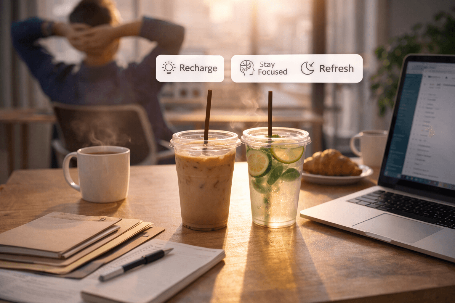
Benefit-led campaigns drove attention and curiosity. People arrived looking for outcomes like energy, focus, recovery, or sleep. But the storefront showed product catalogs. Traffic landed on collection grids, product filters, and individual PDPs.
Benefits were communicated in ads and content, but the site asked shoppers to browse products.
The brand was selling benefits everywhere, except where buying happened.
Changing the unit of selling
The team did not treat this as a product page problem or a filtering issue. Product pages were not redesigned, and no additional navigation layers were introduced. The catalog remained exactly the same. What changed was the selling logic.
Need replaced product as the starting point, and discovery became the entry path. The experience began with the outcome customers wanted and unfolded into a guided exploration.
This was not a visual change but a structural one: a shift in how decisions were organized rather than how products were displayed.
The catalog stayed the same.Collections stayed the same.The selling logic changed.
Discovery became operational
The brand introduced discovery storefronts structured around needs:
- benefits (energy, focus, recovery, sleep)
- time of day (morning, workday, evening)
- occasions (gym, travel, unwind)
Each discovery storefront opened with a need or outcome, guided shoppers through relevant options, grouped products accordingly, and concluded with a focused CTA. Campaign traffic began landing directly into discovery paths instead of product catalogs.
Execution became repeatable:
- identify the need or moment
- duplicate a discovery base
- adjust products and messaging
- launch
What previously relied on browsing became structured exploration. Discovery shifted from navigation to a scalable merchandising layer.
What changed
- The brand could run more benefit-led campaigns without restructuring the site
- Curiosity traffic landed into guided discovery paths
- Merchandising shifted from catalog management → discovery orchestration
- Execution moved from browsing reliance → structured exploration
Buying shifted from scanning products to solving a need.
The real breakthrough
The breakthrough wasn't more filters or better collections. It was the ability to generate multiple discovery storefronts dynamically based on how customers entered and what they were trying to solve: benefits, time of day, or occasions.
Discovery stopped being browsing.It became a system the brand could create, adapt, and scale.
Key Takeaways
Need became the primary selling unit, not products
Campaigns could land into guided discovery environments
Merchandising shifted from catalog curation to discovery orchestration
New benefit-led paths could be launched without restructuring the site
Selling evolved from browsing products to solving for outcomes